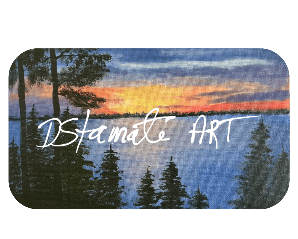
Discover Acrylic Painting Techniques Behind DStamate Art Style

Published October 9th, 2026
Acrylic painting offers a vibrant, flexible way to capture the mood and detail of natural scenes and beloved pets. At DStamate Art, I focus on original acrylic paintings that bring to life landscapes, seascapes, riverscapes, and custom pet portraits through careful brushwork and layered color. Whether it's the sweeping calm of a rural field or the expressive fur of a treasured animal, the techniques behind each piece shape its unique presence. Understanding these methods brings a new appreciation for the craftsmanship involved, revealing how subtle choices in paint, brush, and layering come together to create artwork that feels both familiar and fresh. This introduction invites you to explore the distinctive acrylic techniques I use to build depth, texture, and emotion in every canvas, making each painting a true storybook vista or intimate portrait.
Foundations of Acrylic Painting: Materials and Basic Techniques
When I build an acrylic painting, I start with simple, reliable materials. I use artist-grade acrylic paints because they hold strong color and dry to a durable, flexible surface. Heavier body paints give me crisp brushstrokes in landscape paintings, while softer, more fluid paints help me describe fur and subtle features in pet portraits.
Brush choice shapes the character of each mark. I reach for synthetic flats and filberts for broad fields, skies, and riverscape paintings, and smaller rounds and liners for whiskers, eye highlights, and branches. Palette knives come out when I want broken rock edges, rough bark, or thicker, sculpted paint in original paintings on canvas.
The surface matters just as much. I prefer stretched canvas or canvas panels with a light tooth, which grips the paint without fighting every stroke. That texture supports both smooth glazing in distant hills and more direct, textured strokes in foreground grasses or fur.
Core acrylic painting techniques
Basic acrylic painting techniques form the backbone of my process. Layering is the first. Because acrylics dry quickly, I can stack thin layers to build depth in fields, shorelines, and skies. Early layers stay simple and broad; later ones refine shapes, patterns, and small details.
Blending happens while the paint is still wet. I work two colors next to each other, then soften the edge with a clean, slightly damp brush. This creates gentle shifts in sunset clouds, soft fur transitions, or reflections on water. Thoughtful acrylic color mixing before the brush touches the canvas keeps these blends clean instead of muddy.
With glazing, I thin acrylic paint with medium to create transparent veils of color. A cool glaze can push distant trees back into haze; a warm glaze can add late-afternoon light across a dog's coat. These clear layers let earlier brushwork show through, which adds quiet complexity to original artwork without making the surface heavy.
All of this groundwork supports the "storybook vistas from rural America" that define my canvas art and gives custom pet portrait acrylics enough nuance to feel alive. Once these basics are in place, more intricate texture and color effects become possible without losing clarity or structure.
Layering and Texture: Building Depth in Landscape Paintings
Layering gives my landscape paintings their sense of air and distance. Instead of trying to finish an area in one pass, I build the scene from loose, thin layers into more deliberate, textured strokes. Each stage has a job: establish light, set atmosphere, then describe specific forms like branches, ripples, or blades of grass.
I usually begin with an acrylic underpainting. This first layer blocks in the main shapes and values with thinned paint, almost like a map of light and shadow. A warm, earthy underpainting sets up a nostalgic, storybook feel for rural roads and barns; a cooler base lays the groundwork for misty riverscapes or overcast fields. Even when most of it gets covered, that initial tone peeks through later layers and ties the scene together.
On top of the underpainting, I alternate between transparent and opaque color. Transparent passes stay thin and fluid, closer to watercolor in behavior. I use them to restate large shapes of sky, distant hills, and water, letting the earlier drawing and brushwork show through. Opaque paint comes next in thicker strokes to catch foreground light on rocks, tree trunks, fence posts, and cloud edges. This contrast between see-through and solid color creates the glowing depth that suits my "storybook vistas from rural America" theme.
Glazing refines the mood. After the main structure is dry, I brush on soft veils of transparent color to nudge the atmosphere. A blue-violet glaze cools down far-off tree lines and pushes them deeper into space. A thin, warm glaze over a field suggests late-afternoon sun drifting in, while a muted green glaze over water can quiet its surface and make reflections sit more naturally.
Texture grows as I move closer to the viewer's space in the painting. For grass and foliage, I stack short, varied strokes over smoother underlayers, changing direction and pressure so the marks feel organic rather than patterned. In rocky streambeds or weathered barns, I sometimes drag a nearly dry brush over raised paint or use a palette knife to scrape across existing layers. The paint catches on the peaks of previous strokes, breaking color into small, crisp fragments that read as bark, stone, or rough boards without painting every detail.
Water and sky stay gentler. I keep their surfaces smoother by blending wet edges just enough to avoid hard bands of color, then adding a few sharper, opaque strokes where light hits a wave top or cloud rim. This balance between soft gradients and selected texture hints at movement while preserving calm space in the composition.
The same layered approach carries into my acrylic pet portraits, but there the texture shifts from grass and bark to fur and whiskers. The groundwork in landscapes-underpainting, glazing, and controlled brushwork-becomes the framework for building believable coats, clear eyes, and subtle shifts of color in an animal's face.
Capturing Character: Acrylic Techniques for Custom Pet Portraits
The same layered structure that supports my landscape paintings shifts into something more intimate in custom pet portraits. Instead of distant fields and rivers, the focus narrows to bone structure, fur direction, and the spark in a pet's eyes. Acrylic painting techniques give me enough control to describe those tiny shifts without losing freshness.
I still begin with an acrylic underpainting, but here it acts like a skeleton for the portrait. I block in the main forms with thin, neutral color to locate the skull, muzzle, and major shadow shapes. Keeping this stage simple helps me avoid stiff outlines later and keeps the pose natural, the way the animal actually carries itself.
Once the structure feels solid, I build fur in stages. For short, sleek coats, I use smoother, flatter strokes that follow the lay of the hair. A soft base layer sets overall color and value; then I add tighter strokes on top in slightly lighter or darker tones. For long or curly fur, I loosen the brushwork and let the marks overlap more. I use a mix of small rounds and liners, changing pressure so edges of tufts stay varied instead of perfectly even.
Layering does most of the work. I move from broad color masses into finer strands, always thinking about which clumps of fur catch light and which sink into shadow. Instead of painting every single hair, I group them into meaningful shapes, then break select edges with thin, directional strokes. This approach keeps the coat believable without turning it into static noise.
Color mixing carries a lot of character. Black fur rarely stays pure black; I fold in blues, violets, or warm browns so shadows feel deep but not flat. On pale or white coats, I lean on soft grays, creams, and muted blues to shape the form. Subtle color shifts inside the same region of fur suggest warmth over a shoulder, cooler tones under the jaw, or reflected color from a nearby blanket or floor.
Glazing acts as a quiet correction tool. After the main fur texture dries, I brush on transparent layers to push parts of the coat forward or back. A warm glaze over the top plane of a head strengthens sunlit areas, while a cooler, darker glaze under the chest settles it into shadow. These thin veils keep earlier brushwork visible, which preserves that sense of depth and movement inside the coat.
Eyes demand a slower, more deliberate approach. I start by mapping the darks: pupil shape, upper lid shadow, and the deepest ring around the iris. Then I mix several close values inside the iris rather than one flat color. Short, radiating strokes describe the pattern of the eye, and a thin glaze over parts of the iris softens any abrupt jumps. The final step is a crisp highlight placed with a small round brush; its size, shape, and edge sharpness decide how alert or gentle the gaze feels.
Compared with landscape work, where broad skies and distant trees invite more sweeping strokes, pet portraits rely on tighter control and smaller marks. The shared thread is acrylic art craftsmanship: careful underpainting, considered color mixing, and patient layering. In landscapes, those methods build atmosphere and distance. In pet portraits, the same discipline turns into whiskers, glossy noses, and coats that seem touchable, so the animal feels present rather than generically rendered.
Color Mixing and Palette Choices: Defining Mood and Style
Color decisions sit underneath everything I paint. Before I touch the canvas, I sort out a limited palette that fits the story I want the piece to tell. Restricting the number of colors keeps the scene unified and lets small shifts in hue carry more emotional weight.
For most acrylic paintings, I start with a few reliable primaries, an earth tone or two, and white. From there I mix almost every color on the palette rather than squeezing out pre-mixed greens or purples. This keeps the relationships tight; a bit of the same blue shows up in water, sky, and even the shadows of a barn or a dog's coat, which quietly ties the painting together.
In landscape and riverscape paintings, I lean on softened, natural mixes instead of loud, unmixed pigment. Greens pass through muted yellows and blues, and I temper them with touches of red or umber so fields feel lived-in rather than artificial. Skies often hinge on a gentle shift from warmer blue near the horizon into cooler, deeper notes overhead. Those transitions hold the "storybook vistas from rural America" mood: calm, inviting, slightly nostalgic.
Seascape paintings and shorelines ask for a different balance. I mix cooler, grayer blues and soft aquas for water, then warm the light with hints of peach or gold where it skims a wave or cloud. Small accents of higher-chroma color stay reserved for focal spots-sun on a crest, a stretch of sand, a distant roofline-so the eye knows where to rest.
Color mixing in pet portraits aims at lifelike warmth more than wide-open atmosphere. I rarely use straight black for shadows; instead I build darks from deep blues, violets, and browns so the coat keeps a sense of depth. Even white fur holds layers of creams, soft grays, and muted blues. These close-value shifts carry the shape of the body and hint at the light in the room without shouting for attention.
Eyes and noses call for the most controlled palette choices. I mix several near-neighbor browns or ambers for an iris, then thread through tiny notes of complementary color to keep it from looking flat. The brightest highlight often includes a touch of the surrounding sky or wall color, which plants the animal in the same world as the background instead of floating on top of it.
Across original paintings and custom pet portrait acrylics, my color decisions always serve the narrative. Cooler palettes with softened contrasts tend to suggest quiet mornings, mist, or memory. Warmer mixes with clearer light feel closer, more personal, like a familiar path or a beloved animal stepping toward you. By adjusting how muted or intense each mixture becomes-and where those notes appear in the composition-I can steer the mood without changing the subject matter.
That balance between naturalistic color and gentle exaggeration is where the dstamate art acrylic style lives. I want the hues to feel believable, but also edged enough to carry emotion: a field that seems to breathe, a river that feels cold on the skin, a dog whose fur tone alone hints at its age or temperament. Technique sets up the possibilities, but palette choices decide how the scene and the subject speak.
Bringing It All Together: The Acrylic Painting Process Behind DStamate Art Originals
Every original artwork I create follows a consistent rhythm, whether it turns into a quiet pasture, a river bend, or a sleeping dog. The process always starts with intention: I sort out the story first. For a rural scene, that might be the way light grazes a fence line; for acrylic pet portraits, it could be the tilt of a head or the weight of a gaze.
With that idea in place, I sketch loose shapes and lay in an underpainting to anchor value and composition. This early pass stays simple on purpose. I want clear light and shadow before I worry about fur, tree branches, or waves. Foundational drawing, value, and edges form the scaffolding that holds every later decision.
Once the skeleton is sound, I move into structured layering. Broad, mid-value color masses come first, grouped by planes of space or parts of the body. Transparent passes suggest atmosphere in fields and rivers, while more opaque strokes begin to define key features in custom pet portrait acrylics. Each layer has a specific job-build form, deepen space, or refine a focal point-so the painting grows in a controlled way.
Texture and detail ride on top of this groundwork. I shift between softer blending for skies, water, and short fur, and more assertive marks or knife work for bark, stone, and taller grasses. The goal is to vary the surface without scattering attention: quieter passages let the eye rest; textured ones carry the narrative.
Color mixing threads through the whole process. I keep a limited set of pigments on the palette and mix most hues from those few anchors. That restraint keeps storybook vistas acrylic paintings and intimate portraits joined by a shared color language, even when the subjects differ.
Throughout, I balance planning with intuition. The technical discipline-underpainting, deliberate layering, controlled edges-keeps the structure strong. Intuitive moves step in later: shifting a tree line, softening a jaw, or cooling a shadow so the mood lands just right. Each stroke is placed by hand, adjusted in real time, and judged against the feeling I want the finished piece to hold.
By the final passes, only the most essential notes remain to be added: a highlight along a riverbank, a glint in an eye, a rim of light on a barn roof or ear. Those last marks tie together weeks of careful decisions into a single, cohesive image. The result is a piece of canvas art acrylics that exists as one-of-one-an original painting that carries my specific reading of rural American spaces and the animals that share them, permanently fixed in layers of color and texture.
The distinctive acrylic painting techniques behind DStamate Art blend careful craftsmanship with a personal vision that brings rural America's storybook vistas and beloved pets to life. Through layered underpaintings, thoughtful color mixing, and varied textures, each original painting or pet portrait captures mood and detail with warmth and clarity. Whether it's the gentle glow of a riverscape or the nuanced fur of a faithful companion, these handcrafted works invite viewers into a quiet, intimate world shaped by an evolving artistic perspective. Exploring the portfolio offers a chance to experience these original acrylic paintings firsthand, each one a unique expression rather than a reproduction. For art lovers seeking to enrich their spaces with meaningful, handcrafted canvas art or to commission a custom pet portrait, browsing and purchasing online from this Michigan-based artist provides a welcoming and accessible way to connect with original artwork that speaks to both heart and home.